
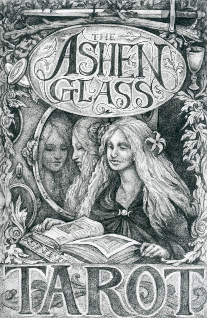
I started drawing my own tarot illustrations a while back by picking cards at random and doing a detailed graphite drawing on a block of 4 x 6″ hot press watercolor paper. The result is that I now have about thirty of seventy eight total pencil drawings for a tarot deck, which is pretty rad.
The rough part is that I’m not sure how to color them, or even if I should. I really like the tooth of the paper, and I kind of want it to show through with whatever I’m doing. On the other hand, I love color, and color can be a really interesting part of tarot symbolism, so I’m torn. Part of me wants to do something really modern with color, as a contrast to really classical look I was going for in the sketches, but I’m not sure what that actually looks like yet!
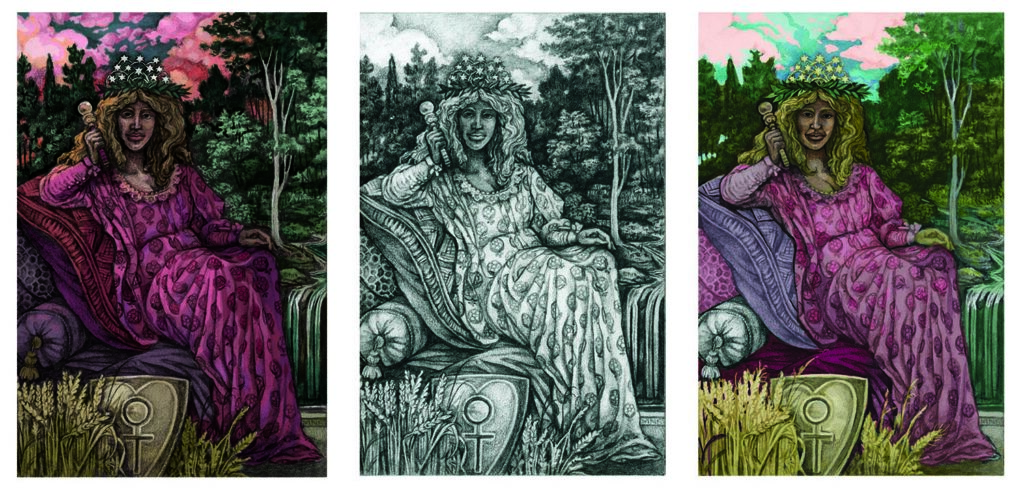
I have spent a ton of time playing around with coloring in Photoshop, primarily with just three of the images, using them as an excuse to experiment with digital painting and different techniques. I hope that I’m learning through this whole process, because so far I’m not really happy with any of my attempts.
Good news, though. My new printer handles my proofs beautifully.