Clouds are really intimidating to draw. We don’t like to admit it, right? After all, we learned in elementary school what “cloud” looks like: a lumpy amorphous shape with a flattened bottom! Easy! And then you look up at the actual sky and you realize that’s woefully insufficient. Especially at dawn or dusk, when the sun’s direction and intensity changes and the light does stuff to all that water vapor. New planes appear, light diffuses, colors become fantastic.
It’s enough to make you swear that you could not possibly ever, in a million years, proceed to capture it. Then you proceed to try.

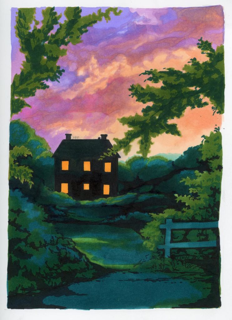
This is not how the sky looked, but art is one of those places where you get points for trying.
I used mixed brand alcohol ink markers over a very rough graphite sketch. This is another color study, where my aim was just to see the colors next to each other as I had them in my head. It’s my usual gang of jewel tones. I gravitate weirdly toward the secondary colors on the color wheel, but I think that they can do some really interesting, unexpected things. This sketch is definitely unfinished, and I would add detail in the form of window casing first of all.
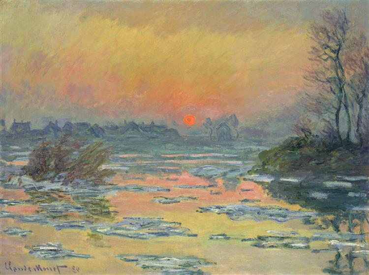
Since I started off by bashing human ability to paint beautiful sunsets, I feel the need to sign out by sharing a truly masterful attempt:

Look! We’re even on the same secondary-color-scheme team! We can all be jealous of Claude Monet and how radical that neon orange sun is.

