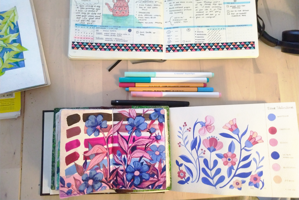
I’ve mentioned before that sometimes I re-visit the same themes year-to-year. Sometimes that goes for particular color palettes, too.
Such is the case for my current color obsession. After painting a sketch last week, I realized that it’s almost exactly the colors that were on my gouache palette this time last year. Side-by-side, the contrast between the two bunches of flowers is also really apparent – my biggest challenge right now is to loosen up my style, so this year my flowers are a lot more busy and energetic!
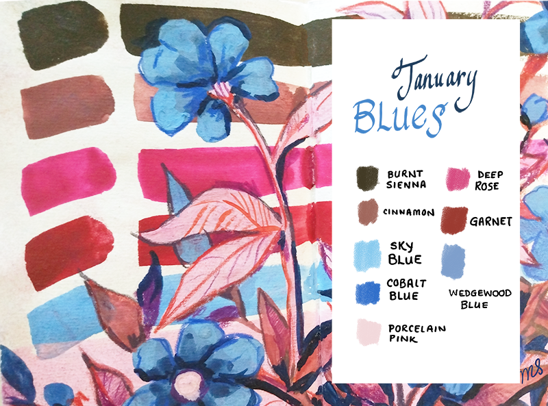
I think that these palettes both started with the idea of making cool blues get along with deep, garnet red in a way that looked nicely balanced. I love dark red in the middle of winter, maybe because it’s January’s birthstone, but also because it’s just warm midwinter sort of color. Although red and blue are usually associated with summer, to me deep red and bright blue make me think of snowy footprints and knitted mittens!