
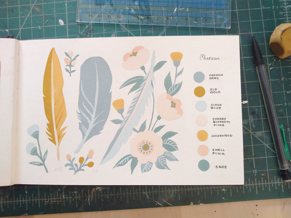
For the last couple of weeks, my Friday post has featured a curated palette. In that spirit, I wanted to share something again from my little book of color palettes. Today, I have gouache sketch that contrasts bright, brassy yellow with soft pastels.
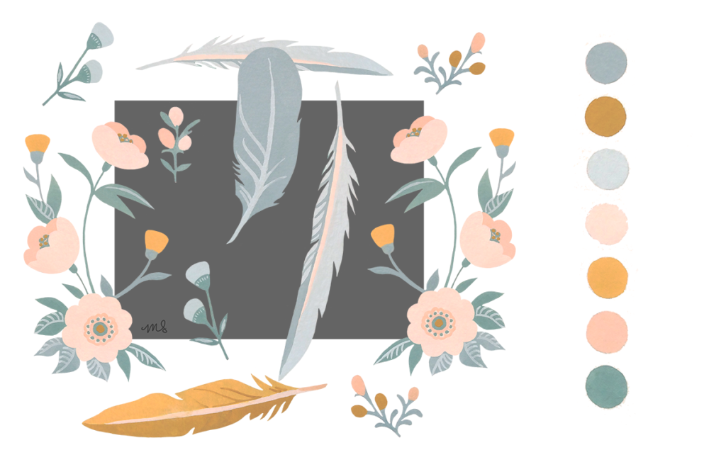
I called this palette “Chateau” in my sketchbook because it reminds me of French country style: with tarnished gold, pearly blue-grays, and blossom pinks. Next to the pastels, the only other cool color here is sage that looks pretty vibrant on its own, but actually contains a lot of gray.