Today was my self-imposed deadline for finishing the six mixed media drawings I’ve been working on. I’m happy (but exhausted) to say that I’ve made it in under the wire – the drawings are finished and tucked into a portfolio “resting” where I can’t see them. If I don’t do this, the impulse to get them out and pick at them every ten minutes will consume me until I jump out the window. I will look at them again on Wednesday. By that time, I will have forgotten what they look like and can approach them again like a sane person, or at least a person with fresh eyes.
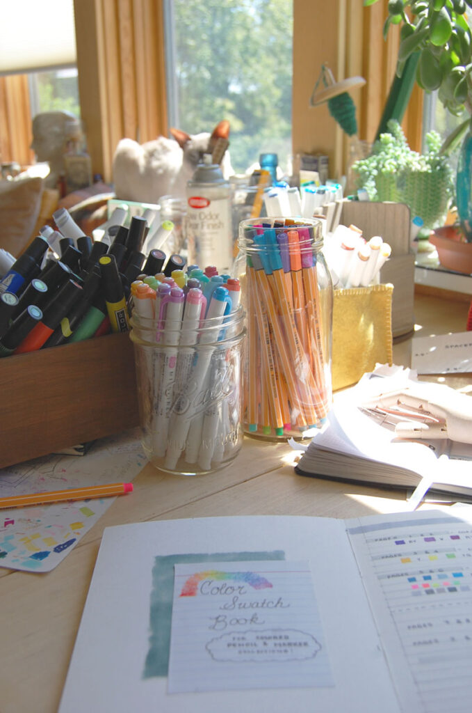
In the meantime, I’m jumping back on the bandwagon with a post about something that I’ve been putting together over the past couple of weeks: a color swatch book!
I’ve needed one for a long time – somewhere where I can keep samples of every color of marker and pencil in my collection. Before this, I was dealing with a situation where I had pieces of card taped to the wide-mouth Ball jars. That worked perfectly well as long as my collection fit in the jars. But markers are big and clunky and that hasn’t been the case for… a while now. I’m working on it.
In the meantime, it has been hard to identify what I need to collect next. I have found myself in a world where I have a couple of dozen markers with yellow caps, and I have no idea whether or not any of them is pale yellow, or buttercup yellow, or dandelion yellow. In my case it’s probably one of about six indiscernible muddy daffodil colors courtesy of the off-brand roots of my marker collection. I hit a point where I was having a hard time just because I couldn’t find what I needed and couldn’t even see everything I had. So I made a thing, and I love it.
I will never again be baffled by exactly which yellows I do and don’t have! Here comes…
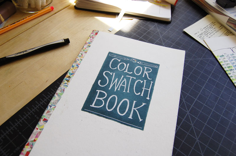
I made the book myself, using the end of a watercolor paper pad. Each page was folded and punched, then sewn together with a kettle stitch, and finally stabilized and pressed with a little PVA glue (which is pretty much just flexible, archival-quality standard white glue). I love book binding, so sometimes when I have a weird amount of paper left in a sketchbook, I get a kind of itch to transform it into a smaller, heftier book. That was the case with this, which I had stashed off to the side for some eventual fun idea.
Normally, something like this is just called a text block: the “block” of folded, sewn, and glued pages that are meant to be bound into and protected by the cover. For my purposes, I just needed a sturdy little notebook. In fact, I glued every other page of the watercolor paper together to create a double-thick surface. When it came to the outside, I left the paper mostly white, decorating it a little myself. The white surface is already a little marred with use, so the first thing that the next version would get is a cover. I used wide washi tape to cover the spine, just for decoration to cover the stitching and glue.
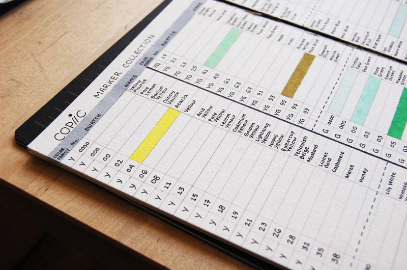
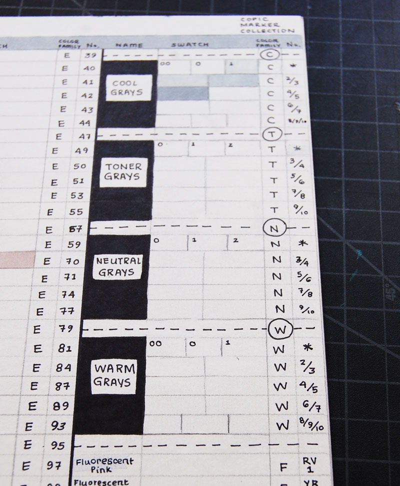
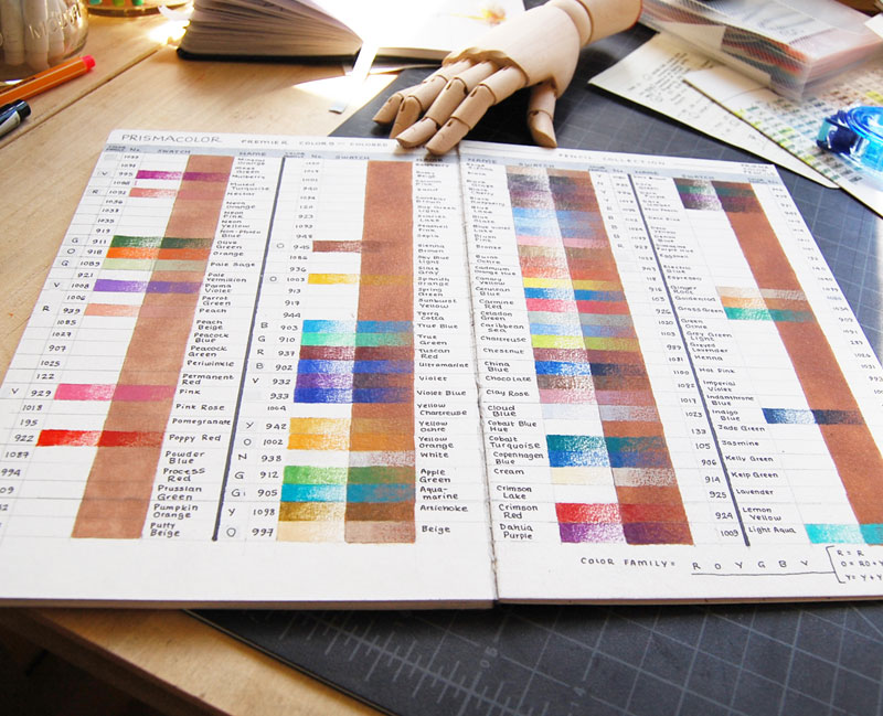
I settled on a nice, simple layout pretty quickly that you can organize by color family (you might also say by hue or by ROYGBV). That way, the layout is flexible enough to accommodate all of the brands that I can think of, and you can categorize the colors exactly the way that you want to. For this try, I was trying to be compact enough with my space to make room for the dozens of markers in this specific product range. I just made it within my space limitations, with my collection of random Prismacolor markers on a 3 x 5″ card pasted onto the the final page!
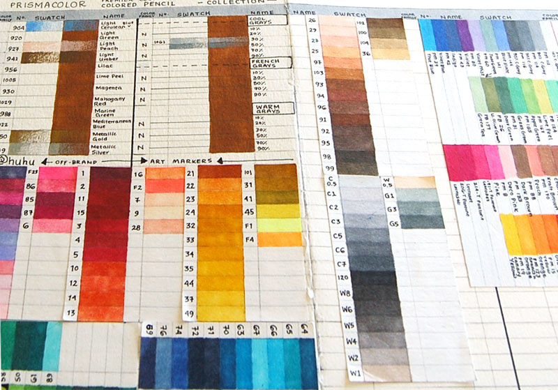
I experimented with toning a column of the swatch chart for my colored pencils, and it worked really well to demonstrate how the color looks on both white and kraft toned paper. When I make a second, more polished version of the swatchbook, I’ll have more room and more space to add things watercolor gradients and mixing areas. With the way that the pages are ruled, you have as much space as you want to extend the swatches vertically as long as you just ignore the ruled lines.
Version number two will probably come out of the woodwork sooner rather than later, because they’re fun to make and (my organization and stationary-loving brain thinks, anyway) kind of neat!