
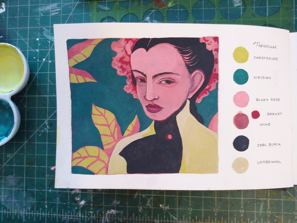
In my small sketchbook of little color palettes, I stick to paintings made with between about six to ten colors. Usually, I start by looking at the well of my honeycomb palette with the most paint leftover in it, and start with that color as my jumping off point.
Today, I had a few teaspoons of deep red and some viridian green. I love palettes based around contrasting colors, but it can be hard to make a red/green color palette that doesn’t look like it belongs on a holiday card. My challenge was to make them into something subdued-tropical, and I was happy with the results this time.
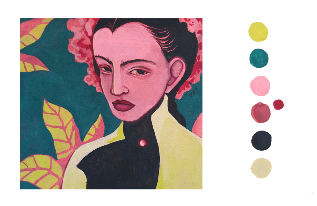
I ended up labelling this color palette ‘Tapestries’ because it reminded me of the colors that remain in medieval tapestries left in the fibers after hanging on a wall for hundreds of years. This isn’t realistic, the coral-y pink and chartreuse green way too vibrant for such an artifact. Even so, I kept the name. I think it has an appropriately noble, faded feel for a jewel-tone painting with bright warm shadows.