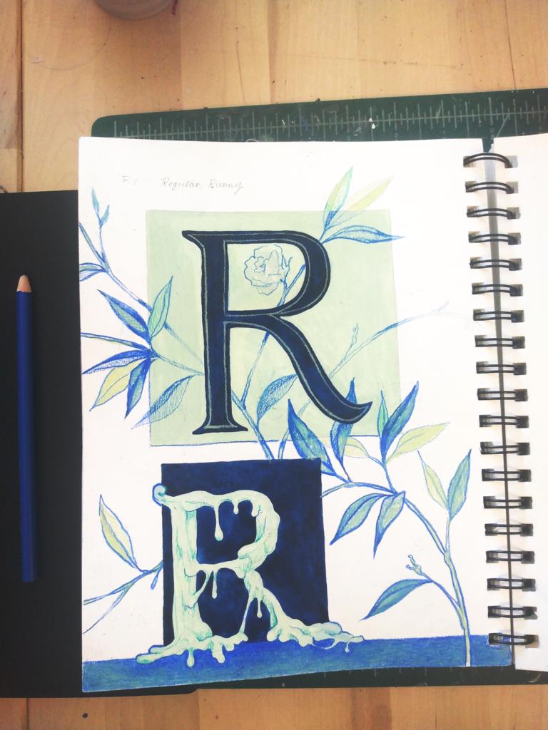
Since I’m hard at work on exciting things that aren’t sketches, I’m keeping it pretty simple today with a typography exercise.
My little game for this page was to draw a very typographically neat letter, and then another version of that letter, distorted. I chose the noble ‘R’ for no real reason. While I was sketching the top letter and trying to make it straight and even-looking, I thought of how I wanted to transform it, and thought it would be fun to make the R runny.
It was fun. Satisfying, in fact, to draw a version that looks like a melting wax sculpture in a horror movie. Since I kept myself limited to a really narrow palette of color, the page came together really quickly. Have I mentioned how much I love just stacking colored pencil on top of gouache? Oh, every time I post? I just can’t believe that it’s taken me so long to discover just how great they are together!